LINZER BIER
Redefining an icon that its city can identify with.
Until 1971 Linz had an own brewery where Linzer Bier was brewed. Now the Linzer Bier is back after around 50 years and Linz is a brewing city again. Our client asked us to develop a clear and captivating visual identity, that feels like the brand had never left, but still could hold a strong position on the modern market against its competitors in the segment.
BRIEF AND APPROACH
Reintroduce a traditional product to its audience. Do less but good.
Regionality is very important in the production of Austrian beer. Since the brand vanished from the Austrian market, the city of Linz still was in need of its own brewery.
Our job?
Refresh the brand and design new packaging to appeal to a bigger market of craft beer customers.
The challenge?
The Austrian beer market is already filled with various brands that are strong competitors on the shelf. The different segments are highly competitive and regional brands have to stand their place against big players.
The solution to the main character
The “Linzer Liesl”, label icon since the earliest years, has been carefully abstracted. The style is adapted to the current zeitgeist, without adapting to it. Ears of barley, hops and traditional costumes from Linz refer to their regional origins.
IMPLEMENTATION
Differentiation is key to be instantly recognized.
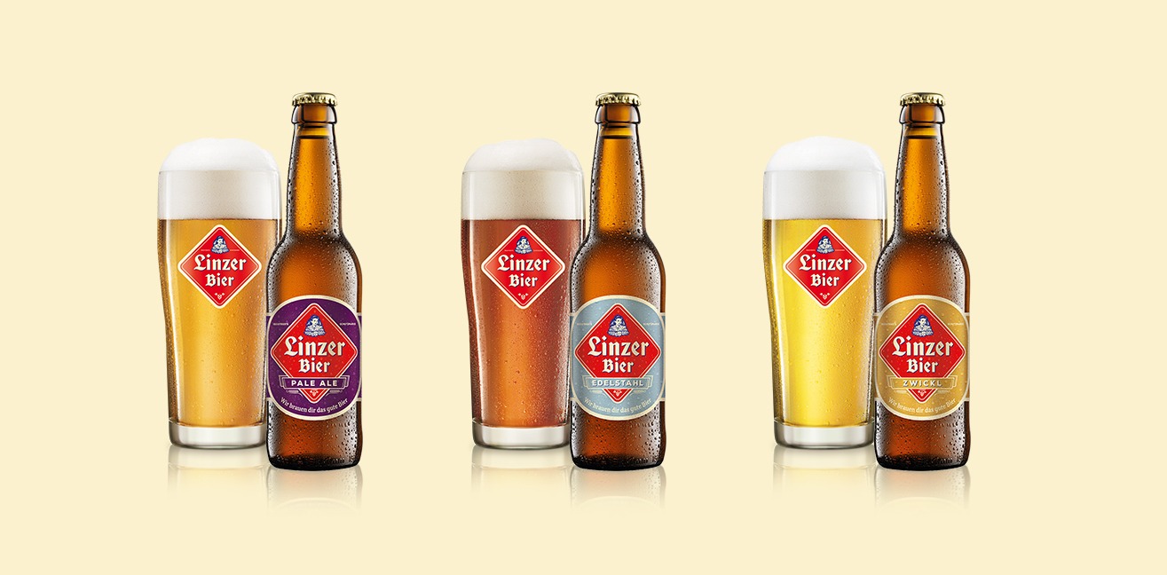
The straightforward, clear Linzer Bier label matches the unpretentious brand personality of the spicy special beer, brewed according to the original recipe from 1921. The Beer “Linzer Original” got company by three new beer types. To differentiate between the beer types, we developed clear colour codes for the bottle labels.
Linzer Pale Ale
A contemporary pale ale with a Linz signature in a strong violet colour.
Linzer Edelstahl
A tribute to the so called steel city Linz is the steely blue-gray colour.
Linzer Zwickl
Ocher was chosen for a light golden, unfiltered beer that tastes particularly mild and tasty.
CONCLUSION
Well-made balance of tradition and modernity
With the new brand design of Linzer Bier a successful balance between simplicity and aesthetics, tradition and modernity was achieved.
Key-Facts:
Client:
CRAFTVOLL GmbH


