HOFBRÄU KALTENHAUSEN
Beer culture that you can see
What people call craft beer today has existed in Kaltenhausen for centuries: finest beer culture off the beaten track. Founded in 1475, the oldest brewery in Salzburg has always combined the craft of traditional brewing with innovative ideas. The task was to make this unique combination visible with a new brand image and packaging design.
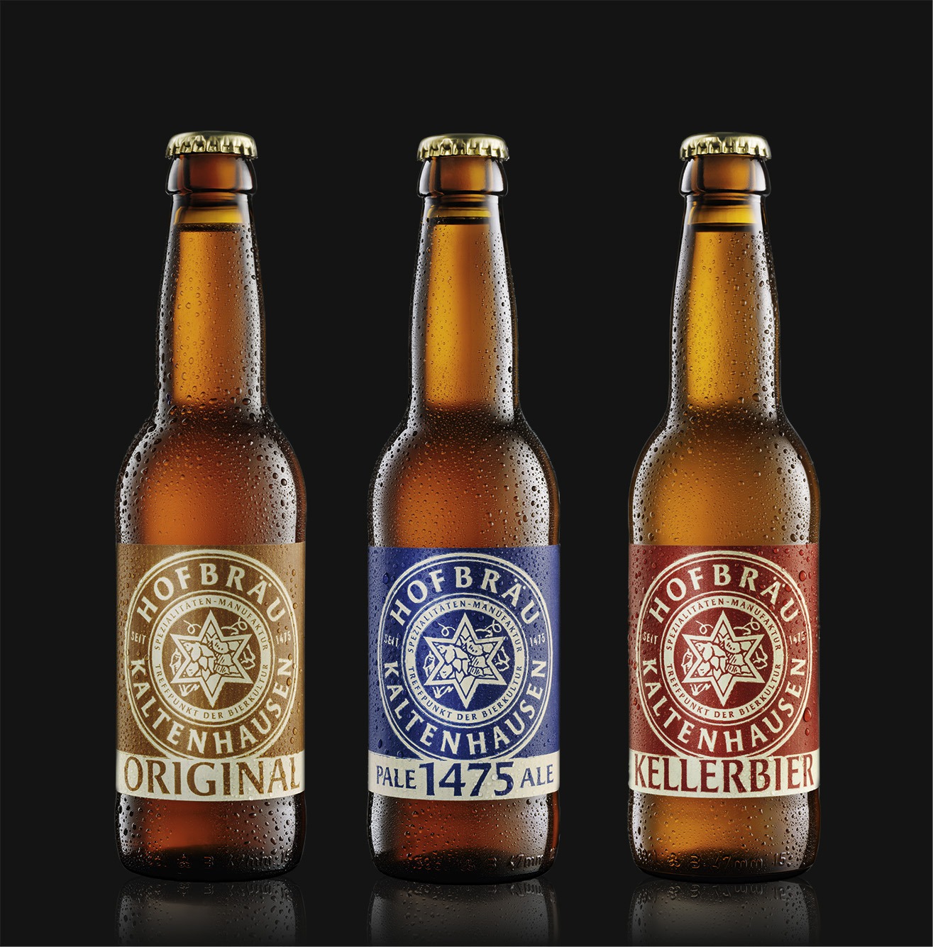
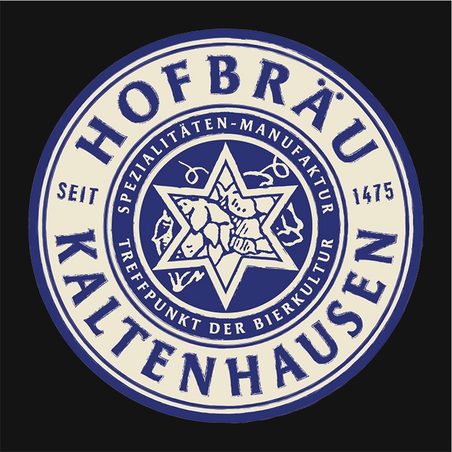
Pichler & Gattringer went to work with a high level of sensitivity. The selection of label paper with special embossing conveys naturalness and craftsmanship both optically and tactilely. The brewery’s characteristic star with its hand-drawn depiction of hops highlights the beer’s craftsmanship and uniqueness.
Every type has its own colour, yet the unified design language gives identity to the entire range and makes it easy to recognise. The editions are embedded in the background with a historic engraving and stand out from the regular product line.
With the new brand identity a very original way was found to keep the balance between simplicity and aesthetics, tradition and modernity. And thus to convey the character of Hofbräu Kaltenhausen at first glance.
Key-Facts:
Auftraggeber:
Brau Union Österreich AG


