SCHWECHATER
Schwechater Bier: Brand and Packaging Redesign.
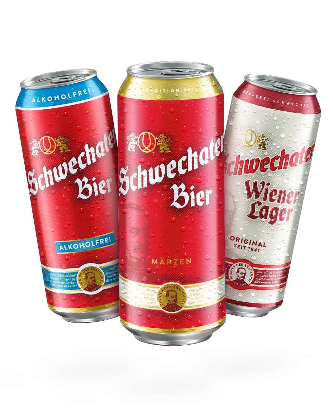
The brand and the entire packaging design of Schwechater Bier was further developed by Pichler & Gattringer across the entire product range.
One of the main objectives was to strengthen the brand identity and iconicity.
It was particularly important to our customer to create a “common thread” across all varieties and to harmonize the product appearance, as well as to create a logical structure of all design elements for the entire range.
This led to a merging of the general brand visual identity with the packaging appearance and, as a result, to an improvement in recognition and a timeless yet contemporary design that creates a beautiful balance between the varieties in the economy segment, Märzen and Alcohol-Free, and the premium specialties, Schwechater Zwickl and Wiener Lager.
LOGO-REDESIGN
Iconic and contemporary.
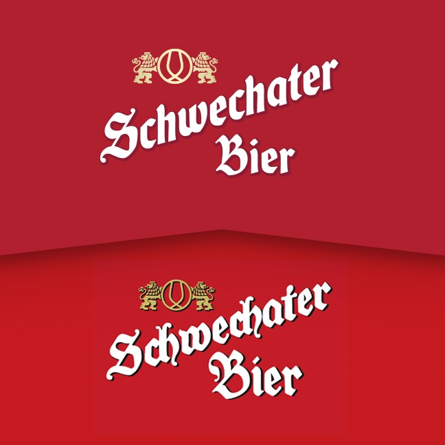
We stripped the new logo lettering of its baroque elements and, through modernized typographic gestures, represents the values of the Schwechater Bier brand personality – reliable, honest and down-to-earth.
The black color was completely removed from the brand logo, thus communicating the friendly, approachable brand character even more effectively.
Of course, the iconic “S” shape was retained, creating a high level of recognition.
COLOURS
Clear colours, powerful effect.
The redesign of the Schwechater brand creates a consistent brand identity, highlighting Schwechater as a proven, traditional brand with a contemporary design.
This is supported by a clear and bold color scheme and typographic gestures.


